
The summer of 2026 has been defined so far by unprecedented levels of heat.
Since late May, a rapid succession of heatwaves has moved across Europe. June was the hottest on record for western Europe, some three degrees above the 1991–2020 average.
England and France both recorded their hottest June ever, while several countries broke all-time records, and more than 10,000 excess deaths were reported across the continent in the final week of June alone. A further heatwave followed in early July.
Heat of this kind is felt most acutely in cities. Dense built-up surfaces, reduced vegetation, and trapped heat from urban infrastructure contribute to the urban heat island effect, causing urban areas to remain warmer than their rural surroundings.
The difference is often most pronounced at night, when cities release stored heat more slowly. During heatwaves, persistently high overnight temperatures can substantially increase health risks by increasing cumulative heat exposure and reducing opportunities for recovery.
For a forecasting system to capture the urban heat island effect, it needs to know where the cities are. As such, the next version of the Artificial Intelligence Forecasting System (AIFS v3) is set to include a static field representing urban extents as forcing; here we show what the machine learning (ML) model does with that field.
Giving the AIFS a view of the city
The AIFS has been steadily growing beyond its initial core atmospheric remit, using Anemoi to represent more of the Earth system with machine learning. Static fields – fixed maps that give the model information about the environment in which weather develops – are an important part of that expansion.
The urban field is one such addition. It tells the model, at every grid point, the impervious fraction of the surface – the proportion covered by roads and buildings – giving a static description of the urban environment that complements the atmospheric state.
Isolating the urban signal
To see what the model attributes to the urban field, we first run the AIFS prototype as normal, forced with the standard urban field, then repeat the forecast with the urban field set to zero everywhere.
This effectively removes cities from the model's view, while keeping the initial conditions identical. The difference between the two forecasts isolates the model's learned urban response, separating it from the weather situation itself.
We perform this test over nine 10-day forecasts between January and July 2026, covering a wide range of seasons and weather regimes, including the record heatwaves. The forecasts run at N320 resolution – a grid spacing of roughly 30 km. To put that in perspective, a single grid box is large enough to hold the whole of central Paris several times over, along with surrounding suburbs and countryside.
A warm signal over the cities
The result is clear (Figure 1). With the urban field, the model produces a warm signal over built-up areas of around 0.2 °C in the ten-day mean, reaching about 0.5 °C at its peak. These magnitudes are close to those produced by the physical Integrated Forecasting System (IFS) urban scheme, which gives summer urban warming of around 0.5 °C at night and around 0.2 °C in the day–night mean.
The signal follows the urban-fraction pattern closely, appearing over cities while leaving the surrounding countryside largely unchanged. The warming is therefore not a broad regional shift. It is localised where the urban field indicates cities, exactly the behaviour expected from a physically meaningful surface signal.
The response also scales with the amount of built-up area. Across European cities, the warming increases systematically with urban fraction, on average around 0.25–0.30 °C across the most urban grid points, and 0.3–0.45 °C at individual city centres.
London, which sits on the highest-urban-fraction grid point in western Europe in this experiment, shows the strongest response. This orderly scaling is strong evidence that the model has learned a relationship with urban form rather than memorising a set of warm locations.
Splitting the signal by time of day reveals something intriguing. The warming peaks in the middle of the day and is weakest overnight (Figure 1c), unlike the night-time maximum often associated with the urban heat island. It behaves more like a surface-heating response, closer to the elevated land-surface temperature that a satellite observes over cities during the day, than to the near-surface canopy effect usually measured after sunset.
One caveat is that our 6-hourly output does not sample the 20–23 UTC period when the urban heat island usually peaks at night, so a stronger night-time response between output steps cannot yet be ruled out. Higher-frequency output might help resolve this.
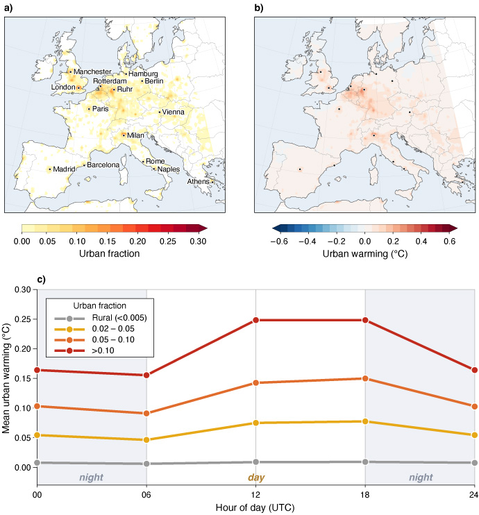
Figure 1: The urban signal for the 6 July 2026 forecast. (a) The static urban-fraction field provided to the model, peaking near 0.3 over London and Paris. (b) The 10-day-mean warming attributable to the field (forecast with the field minus the same forecast with it zeroed): a warm anomaly locked onto the cities, with rural land essentially unchanged. (c) The diurnal cycle of the effect by urban-fraction bin: the warming peaks during the day and is weakest overnight in every bin, while the rural control remains close to zero.
Where does the urban signal come from?
The AIFS prototype is not given a rule for how much warmer a city should be. Instead, it learns relationships between its inputs and the temperature evolution contained in its training data.
This distinction matters. Most of the AIFS prototype pre-training uses ERA5, whose land component has no urban representation at all. Cities are nonetheless warmer in ERA5 than their surroundings because the reanalysis assimilates 2 m temperature observations that carry the warmth of real cities. Any urban response learned at this stage – by far the largest part of training – must therefore come from the observations rather than from a scheme.
The model is subsequently fine-tuned on more recent operational analyses, which do include an explicit urban scheme: a single-layer urban canopy model with canyon geometry. This stage is much smaller than pre-training, but it is designed to shift the model towards the operational analyses, so we cannot rule out a contribution from the scheme to the response we see.
Either way, the model receives only a built-up fraction at each grid point; the temperature response it produces is something it had to work out for itself, and most of the data it learned from contains no urban scheme at all.
Reproducible across seasons
If the model has truly learned from the urban field, the response should appear in any weather situation, and so we check it across all nine forecasts across different seasons and every lead time (Figure 2). The same relationship between warming and urban fraction appears in every forecast.
The effect is also present at every forecast range rather than washing out with lead time, though the curves become noisier at the longest ranges. It appears to grow through the forecast, but the longer lead times also fall later in the calendar, so some of that may simply be the seasonal signal.
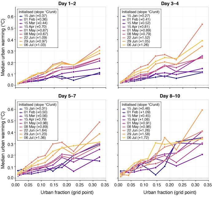
Figure 2: Sensitivity–response by forecast lead time. Median urban warming against urban fraction for the nine initialisation dates (January to July), in four lead-time windows. The response is positive and increases with urban fraction at every range. The seasonal ordering persists throughout – summer initialisations have the steepest response – and the slope strengthens with lead time, showing that the urban signal accumulates rather than decays.
What changes between forecasts is the size of the response, which follows the seasonal cycle. Sensitivity roughly triples from midwinter to midsummer – from around 0.4°C per unit urban fraction in January to 1.25–1.3°C per unit urban fraction in June and July – consistent with a response driven by incoming solar radiation.
A stronger summer urban warming is in line with the physical IFS urban scheme, although the seasonal contrast here looks larger than that scheme produces, and the comparison depends on whether day or night is considered. For a forecasting system, this sensitivity is useful as the strongest urban warming occurs precisely when heatwaves occur and the signal matters most.
Does the forecast get better?
The next question is whether this physically meaningful signal also improves the forecast. The answer is encouraging, though the effect is necessarily modest: a grid-box-average urban warming of a few tenths of a degree is small compared with the synoptic errors that dominate a ten-day forecast.
Station-level scores therefore stay mixed: scored against the current AIFS version there is no statistically significant improvement in scores. A signal of this size cannot be expected to move a single-station score dominated by synoptic error – its effect shows up instead in systematic quantities like bias.
The clearest impact is in temperature bias. During the June heatwave at Paris-Montsouris (Figure 3), adding the urban field reduces the AIFS cold bias from −1.11°C to −0.41°C. The improvement is not uniform: the extra warmth slightly overshoots some later peaks, so RMSE changes little and the IFS stays closest at this station, but the correction is in the right direction.
Across the wider domain, the field has little effect in rural areas, where temperatures are essentially unchanged. On the hottest 10 % of days, the bias reduction grows with urban fraction, reaching around 0.2°C at the most built-up stations.
This picture matches independent work. Using the Bris data-driven model (MET Norway) over the Nordic region, a study likewise found a systematic cold bias over towns in their baseline that was cut to a fifth once urban fraction was supplied as an input.
This similar behaviour in a different kilometre-scale model suggests that this is a property of data-driven forecasting rather than an idiosyncrasy of the AIFS prototype.
The benefit is probably underestimated by the available observations. SYNOP stations are designed to represent their surroundings rather than the warmest parts of cities, and many sit at less representative sites such as airports or in vegetated areas – Paris-Montsouris, for example, is in a central Paris park. Verification against denser urban networks, flux towers, or satellite land-surface temperature would provide the basis for more solid conclusions.
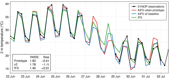
Figure 3: A single station in detail: 2 m temperature at Paris-Montsouris in the ten-day forecast initialised on 22 June 2026. AIFS prototype with the urban field (red), the v2 baseline (blue), IFS (green) and the SYNOP observations (black). The models reproduce the observed diurnal cycle closely across the full ten days, including the record heat peaks near 40°C, and the urban field adds a small, consistent warming that reduces the baseline's cold bias. The inset box reports each model's skill against the station observations: RMSE (°C) and mean bias (°C), forecast − observed), over the ten-day window.
Towards higher-resolution urban forecasts
Two things stand out from these results. First, the AIFS prototype can recover a physically meaningful urban signal from the information in its training data.
Second, the numbers are even more encouraging than they first appear once resolution is taken into account. At N320 – a grid spacing of roughly 30 km – even the densest city centre reaches only about 0.35 urban fraction, because every grid box also includes parks, rivers and suburbs around the built-up core.
The 0.2–0.3°C we measure is therefore a grid-box average, spread across an area tens of kilometres wide; the warming concentrated in the streets themselves is much larger and mostly averaged away. That a coherent, correctly-scaled signal survives this smoothing at all is a strong result, and it points directly to what higher resolution will bring.
As the AIFS moves to finer grids, this representation should become increasingly pronounced and useful for applications – kilometre-scale data-driven models already show larger urban corrections, which is exactly what a grid that resolves a city rather than diluting it would predict.
The growing number of kilometre-scale climate simulations with physical models like the IFS representing urban areas under a changing climate are also an appealing source of data for further improving the AIFS representation of cities on short and longer timescales.
Higher-frequency output will also show whether the daytime-peak response is the whole story or whether a nocturnal maximum appears between the current output intervals.
Just as important is the quality of the input fields themselves. Because these are static descriptors rather than learned rules, they can be improved, corrected and kept up to date without retraining the model.
This is a considerable advantage since training these ML models is expensive and the surface is always changing as cities expand, glaciers retreat and land cover changes seasonally. Continued development of these input datasets is therefore one of the most direct ways to make the forecasts better, both for the physical model on which the AIFS is trained and the AIFS itself.
Cities are where many people experience weather directly, and where extreme heat has its greatest impact. Giving AI-based forecast systems a better representation of the environment in which people live is a small but important step towards more useful forecasts and, through efforts such as the European Commission’s Destination Earth (DestinE) initiative, towards AI-based digital twins of the Earth system.
Top banner image: © leolintang / iStock / Getty Images Plus